Prof. Allen Yee
Spring 2019
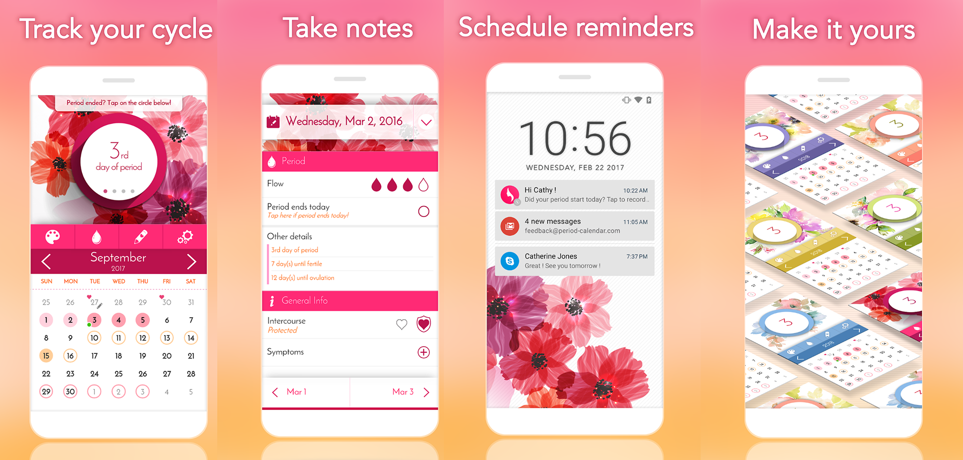
"My Calendar - Period Tracker" by SimpleInnovation, the tracker my non-binary friend uses due to the convenience of its features.

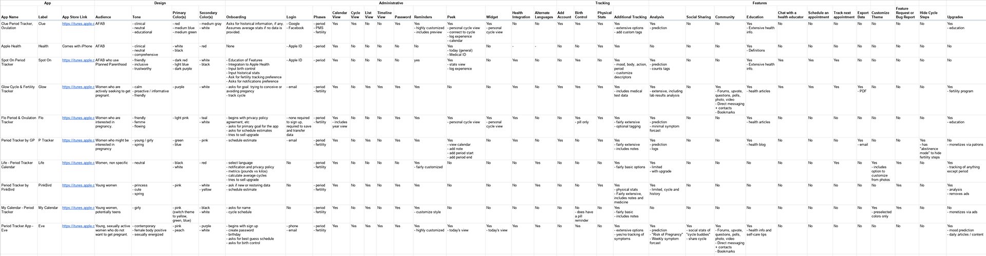
This competitive analysis includes 7 top-rated apps from the Apple Store and 3 apps specifically advertised as gender-inclusive.
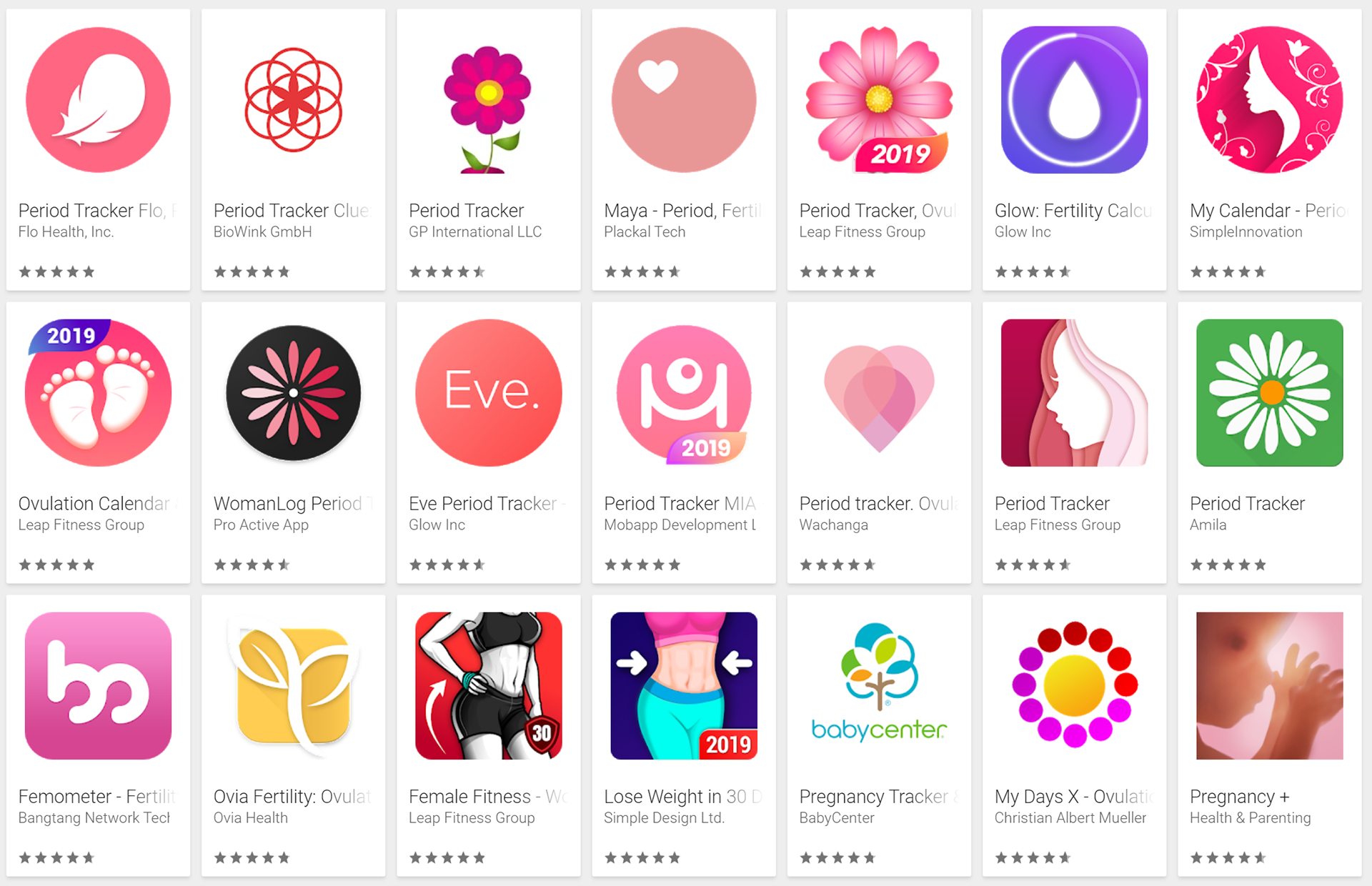
A search for "Period Tracker" in Google Play store returns a wall of pink, flowers, women's bodies, and pregnancy themes. The Apple Store returns similar results.


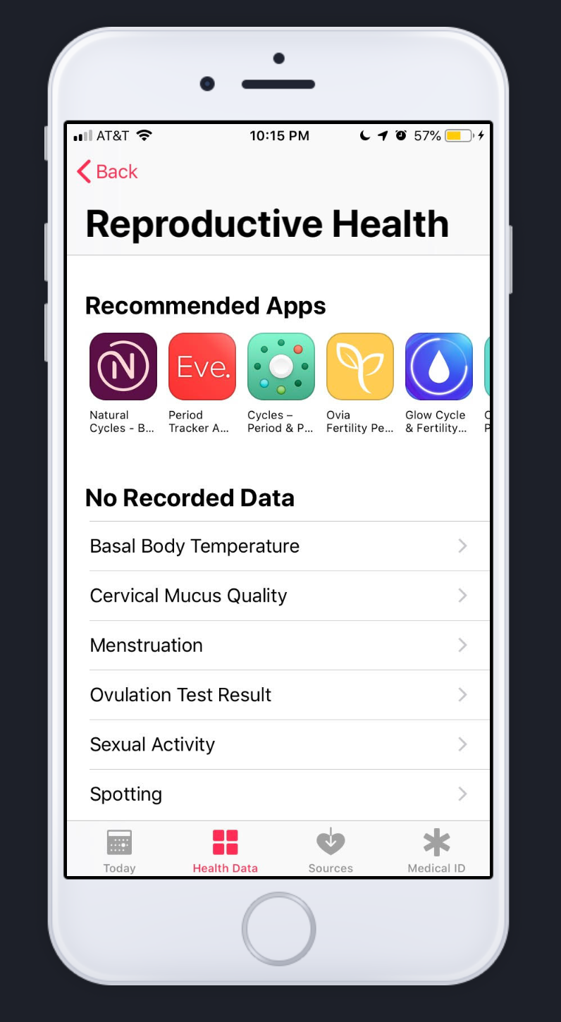
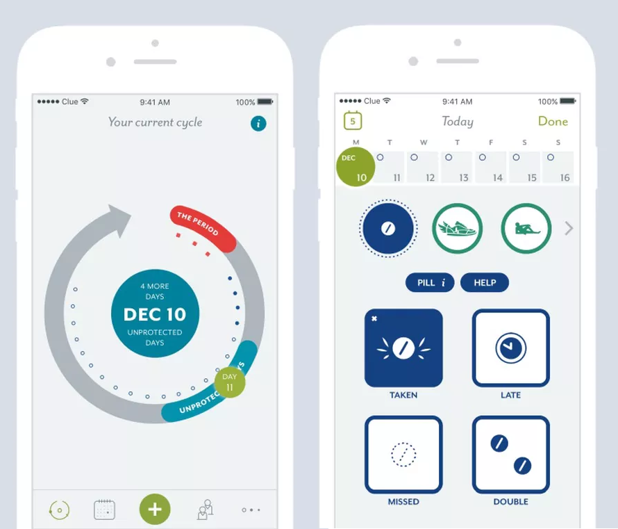
Apple Health
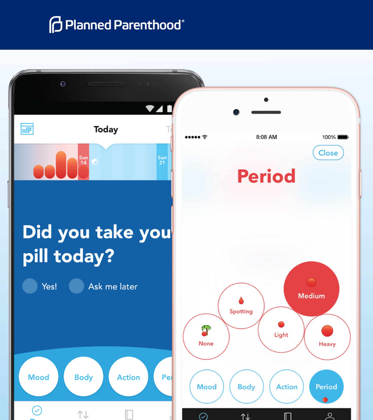
Spot On
Clue

The workshop was run with dry erase boards, thought being that a more temporary form for potentially sensitive information might encourage more sharing.

One response to the question "What does the gender spectrum look like?"

One story about seclusion as a repetitive, inevitable experience.


Participants insisted on a calendar design for the home screen.


The first thing I do is just get thoughts down on paper in any order.

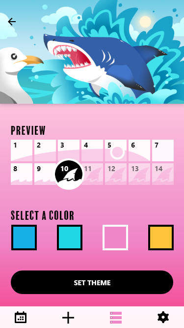
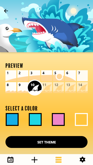
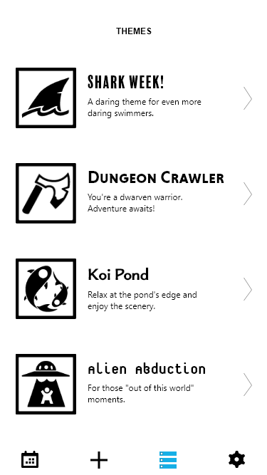
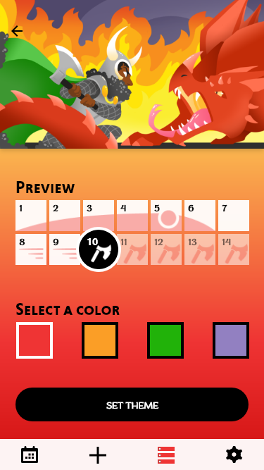
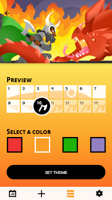
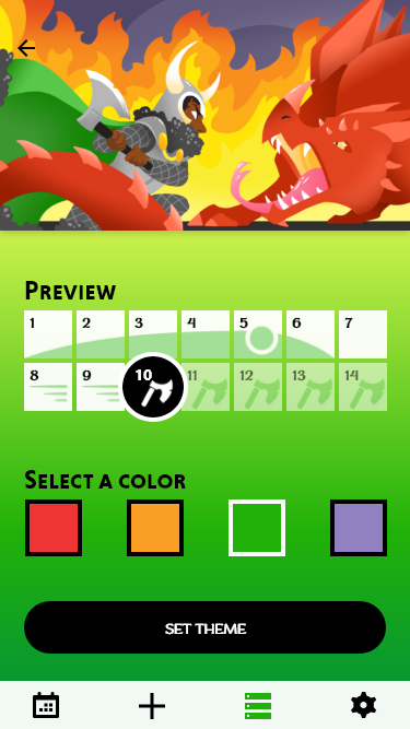
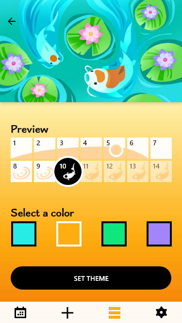
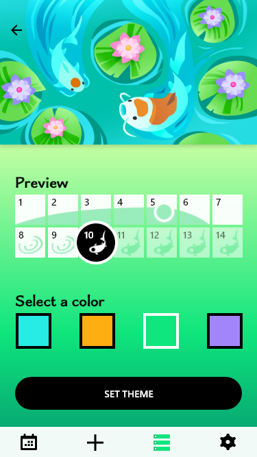
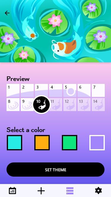
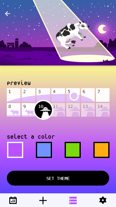
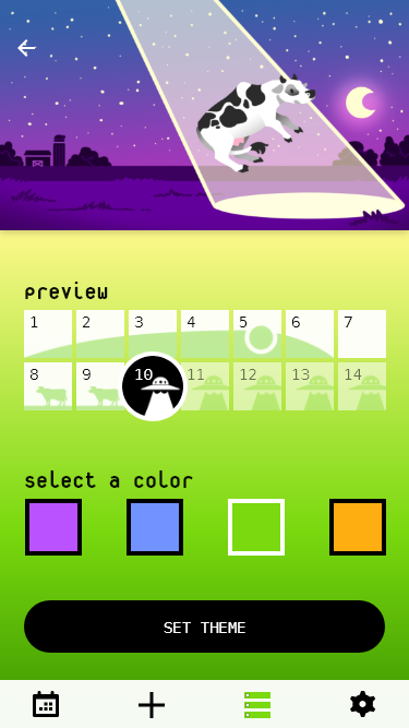
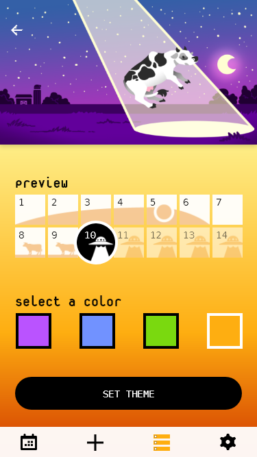
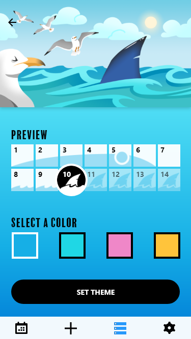
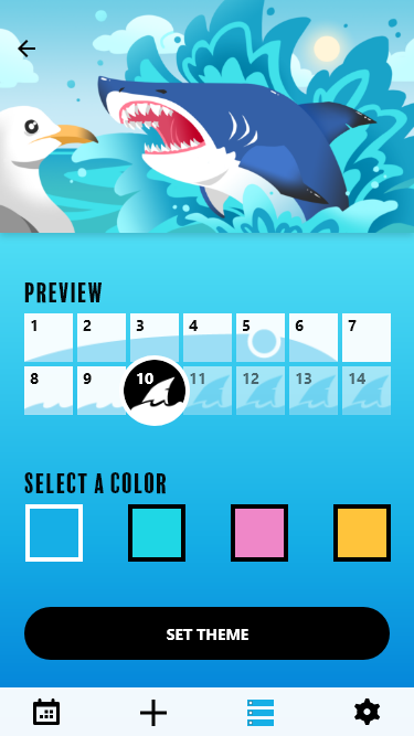
I felt that theme customization could be the primary selling-point of the app. The user would start with a base set of themes, and more could be added with in-app purchases.


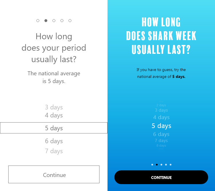
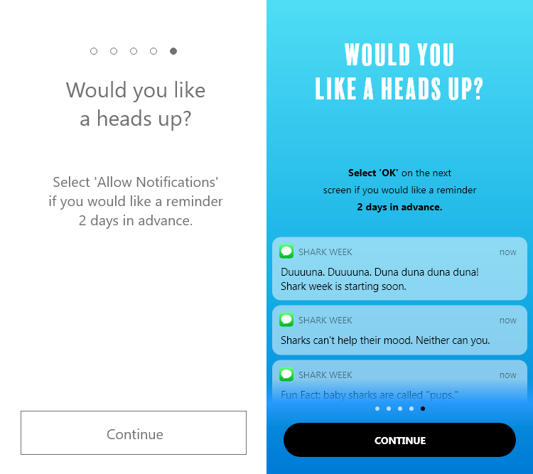
Onboarding for this app already looked overwhelming, so I trimmed it down on paper and tested the length in a low fidelity prototype.
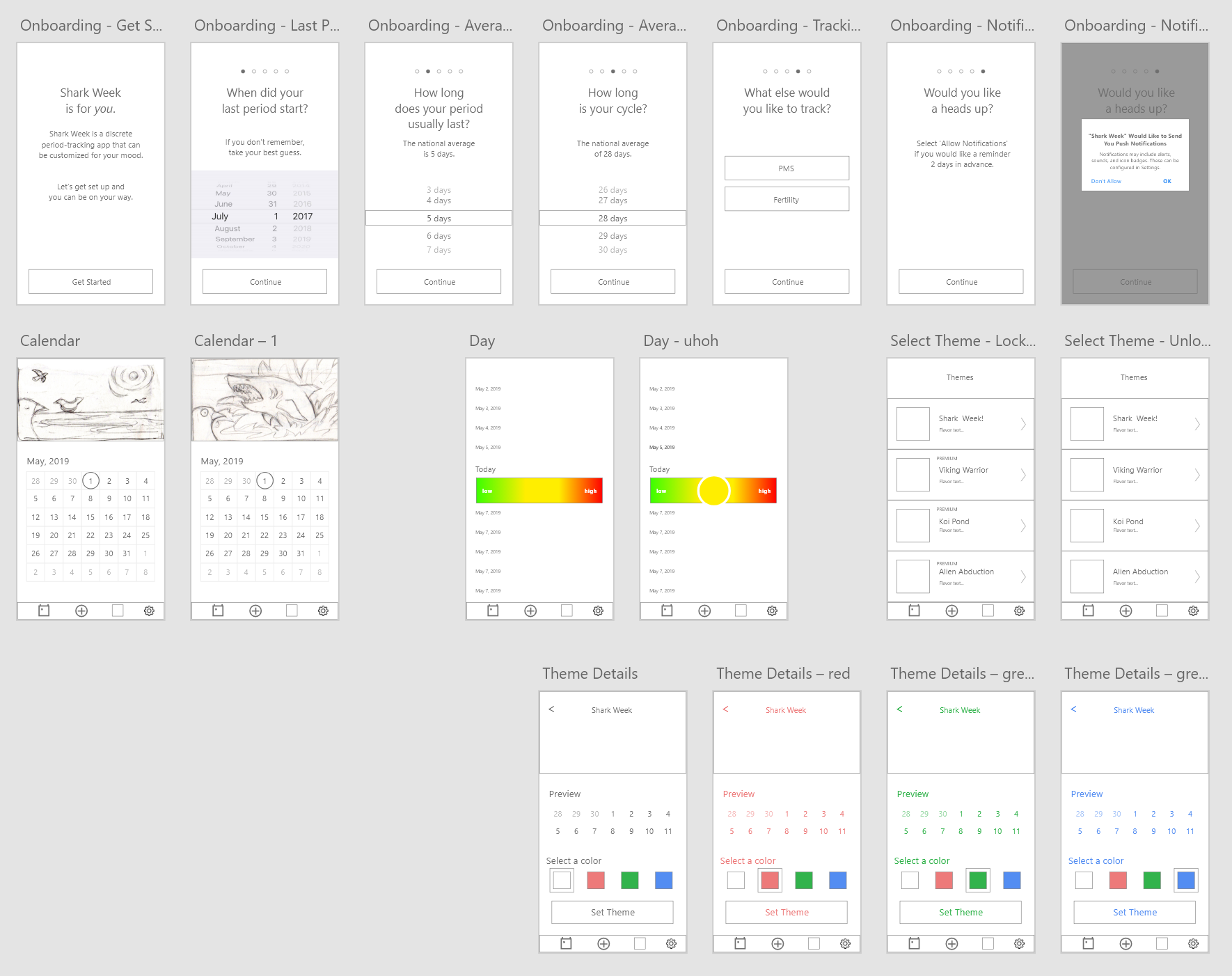
The very first version of Shark Week included only enough screens to test my questions.
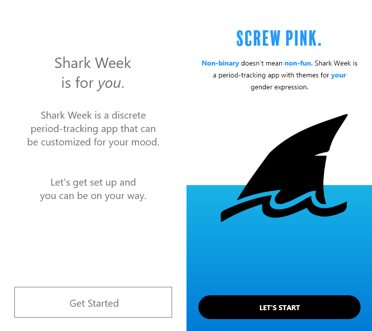
The welcome screen.


Calendar art by Beckah Murray, created for this project.
The first prototype failed to produce the laugh I was looking for.

All is well.
PMS
Period

Fertility Window