Pratt Institute, School of Information
Prof. Elena Villaespesa
May 2018
Prof. Elena Villaespesa
May 2018
Before you read...
This piece is a full usability test report. Chinos Maduagwu, Jamie Raymond, Chen Xiax, and I conducted a series of usability tests with the goal to increase interaction with the Met’s vast online gallery.
Contributions of note:
- The writing and visuals for this report were created by me. (Though deciding on findings and recommendations was a group effort.)
- Scenario, tasks, and interview questions were created by me. (Though objectives for the test were discussed as a team and we all recruited participants and ran tests.)
- I took a project management role for this project.
Executive Summary
This report details the findings from a series of in-person user tests of The Met website (www.metmuseum.org). The purpose of these user tests was to discover what motivates two user groups, Browsers and Researchers, to delve deeper into The Met’s vast online collection of historical works. For this user test, a team of four usability researchers from Pratt Institute’s School of Information and Library Science selected a predefined scenario and a set of navigation-based tasks for each user group to complete using The Met website. This resulted in the following findings and recommendations outlined in this report:
Finding #1: Users navigate the collection via object images.
- Recommendation 1a: Expand the Additional Images heading by default.
- Recommendation 1b: Enlarge the thumbnails in the Related Objects section.
- Recommendation 1c: Enlarge the thumbnails on the All Results search tab.
Finding #2: Users seek to understand an object’s context.
- Recommendation 2a: Organize the Related Objects as a timeline.
- Recommendation 2b: Hyperlink key categories to search results.
Finding #3: Users begin their search with a broad scope and progressively narrow their focus.
- Recommendation 3a: Clarify that the Collections page is a list of broad recommended searches for the Collection.
- Recommendation 3b: Clarify the behavior of search categories.
Introduction
Located in Central Park, The Metropolitan Museum of Art (The Met) in New York City houses art from around the world spanning over 5,000 years. The museum consists of three sites including The Met Fifth Avenue, The Met Breuer, and The Met Cloisters. In 2017 the museum welcomed 7 million visitors, with a total of 31 million visits to the website, 35% of which were international.
A team of four usability researchers from Pratt Institute School of Information and Library Science conducted a series of eight in-person user tests. The purpose of this evaluation was to understand how two target user groups, Browsers and Researchers, are interacting with the online collection on The Met website. This report outlines key findings and recommendations to assist Browsers and Researcher’s interaction with the online collection in order to encourage them to use the website in order to view more of the collection in a single sitting.
Participants from this study included students and freelance artists, known as Browsers, and art educators and professional researchers, known as Researchers. For this user test, the team from Pratt Institute selected a predefined scenario and a set of navigation-based tasks for these two user groups to complete. These tests were recorded using screen capture software. Participants were surveyed before and after the user tests in order to determine their probable motivations for visiting The Met website and the likelihood that they would return. The team then studied the recordings and feedback from these user groups in order to develop a series of findings and recommendations intended to encourage interaction with The Met collection.
Methodology
In-person user testing allows researchers to evaluate a product or service by observing how representatives of selected user groups interact with the product. This helps design and development teams identify usability issues that users may encounter. In-person user testing emphasizes study of the user’s ability to complete specific tasks within a reasonable time frame, as well as user satisfaction and perceived performance (Usability.Gov 2013).
Objective & Methodology
The structure of the user test for The Met website was designed to discover what motivates users to engage with The Met online collection of historical works. The research team sought to find answers for the following questions:
1. What drives users deeper into the collection?
2. What information on the page gets the most attention?
3. What information are users looking for, and are they able to find it?
4. What kinds of links on the page are getting the most attention? What do people expect to see?
5. What intrigued them to the website in the first place, and how does that influence their browsing?
According to previous reports, 66% of visitors to the website do so using a desktop, so this report analyzes desktop navigation.
Each test was administered by at least one member of the team, sometimes two in order to assist with note-taking and analysis. The tools used to record findings included the screen capture programs Silverback (Mac) and Flashback Express (Windows), as well as note-taking by hand or tablet. Users were instructed to begin navigation from The Met Pinterest board in order to start the test from an object page that has initially interested the participant, which represents the starting point for 70% of users on The Met website.
In order to better understand user behavior in relationship to the collection, this investigation relied heavily on asking users why they selected objects from The Met collection, as well as inquiring into expectations for each page and whether their expectations were met. This revealed key locations in the interface where user’s felt notably satisfied or notably confused, which lead to this report’s key findings and recommendations.
Participants & Recruitment
This study included two user types, Browsers (4 participants) and Researchers (4 participants). Browsers and Researchers were identified through the use of a survey, and only those who matched the screener profile exactly were asked to participate in this study. These survey questions were selected based on previous research into user profiles for The Met website:
How much knowledge of art do you consider yourself to have?
- Little knowledge = screened out
- General knowledge = Browser
- Specialist = Researcher
How many times a year do you visit museums?
- 0 = screened out
- 1-3 times a year = Browser
- 4 or more times a year = Researcher
Which reason best describes your use of online art resources?
- To look something up = Researcher
- To find inspiration = Browser
- I don’t use online art resources = screened out
- Other = screened out
These two user groups, Browsers and Researchers, represent a broad set of actual users of The Met website collection. A Browser is largely characterized by a general set of art-related knowledge and seeks to use The Met collection for personal inspiration. A Researcher is largely characterized by a specialized set of art-related knowledge and seeks to use The Met collection for specific information.
Scenario & Tasks
To best visualize how the target user groups would with the collection on The Met website, each participant was given a scenario for context, followed by a set of navigation-based tasks.
[SCENARIO]
Imagine that you’re considering subjects for your next project, and you happen across The Met Pinterest social media account. I would like you to begin by browsing these boards. Please select an object or painting that you would like to learn more about, but don’t click through to The Met website yet.
Before each navigational step, participants were asked to describe what they expected the page to be and what they hoped to learn from that page. Since 70% of users begin their journey into The Met collection from an object page that initially interested them, participants in this test were asked to begin in a similar manner, utilizing The Met Pinterest board as a starting point. The tasks to follow were as outlined here:
[TASK 1] THE OBJECT PAGE (FROM PINTEREST)
1. The participant selects an item they like.
- Why did you select this item?
- What do you want to learn about this item?
- What do you expect you will find when you click through the link?
2. The participant clicks through to The Met object page.
- What is your first impression of this page?
- Please describe what you see on this page.
- Can you find what you were hoping to learn?
- Now that you’re here, what would you like to do next?
[TASK 2] BROWSE (FROM OBJECT PAGE)
3. The participant is asked to find another object they would like to learn about.
- Observation of how they go about doing this.
- Ask them how they’re deciding what to click on and what not to click on.
4. The participant selects another object.
- Why did you select this object?
[TASK 3] SEARCH (FROM COLLECTION PAGE)
5. The participant is guided to the Art > Collection page.
- Asked for impressions and description of what is on the page.
6. The participant runs a search for something that interests them.
- Asked for impressions and description of what is on the page.
[TASK 4] EXPLORATION (FREE FORM)
7. The participant is asked to find an object they would use for their next project.
- Method of exploration is observed.
- Asked for impressions of content on object pages. Does the information they’re looking for change from earlier?
- Do they encounter any difficulties completing this task?
Interviews
Before and after, participants were asked a series of questions in order to determine their motivations and expectations for The Met website. Questions were as follows:
[PRE-TEST QUESTIONS]
1. Tell me a little bit about your relationship with art.
2. How do you go about finding inspiration or research material?
3. (if not specified) Which websites do you use for inspiration or research material?
4. Make note of their primary choice.
5. What’s an upcoming project you’ll be working on?
6. Are you familiar with Pinterest? (If they are not, take a moment to explain what it is.)
[POST-TEST QUESTIONS]
1. How does The Met website compare with (the primary website they use)?
2. Would you use The Met website again to find material for your next project? Why or why not?
Measurement Criteria
Following the collection of data from a total of 8 user testing sessions, the usability team was able to collectively pinpoint key findings and recommendations to encourage engagement with The Met collection, found in the next section of this report. (See Appendix for a list of additional findings and recommendations for minor usability issues discovered during testing.) These findings come from an analysis of each task guided by the following questions:
1. What information is the participant looking for?
2. Did they find it?
3. What information distracted them from exploring further into the collection?
4. What attracted them to the object in the first place?
5. What made them click on it?
6. What did they like about this page?
7. What didn’t they like about this page?
8. Did they mention if anything was missing?
9. Did they have any desires for this page?
10. Additional notes that the group may find useful.
Findings & Recommendations
The findings and recommendations featured in this report are geared toward promoting user interaction with The Met collection. The focus of this study was to learn what motivated participants to interact with objects in the collection, what information they hoped to find (and whether they were able to find it), and what methods Browsers and Researchers used to navigate the collection. This study revealed three key findings:
Finding #1: Users navigate the collection via object images.
- Recommendation 1a: Expand the Additional Images heading by default.
- Recommendation 1b: Enlarge the thumbnails in the Related Objects section.
- Recommendation 1c: Enlarge the thumbnails on the All Results search tab.
Finding #2: Users seek to understand an object’s context.
- Recommendation 2a: Organize the Related Objects as a timeline.
- Recommendation 2b: Hyperlink key categories to search results.
Finding #3: Users begin their search with a broad scope and progressively narrow their focus.
- Recommendation 3a: Clarify that the Collections page is a list of broad recommended searches for the Collection.
- Recommendation 3b: Clarify the behavior of search categories.
These three findings each inspire a series of recommendations in order to promote user engagement with The Met collection based on users’ natural behaviors.
Finding #1: Users navigate the collection via object images.
To focus on learning what motivates users to navigate deeper into The Met collection, participants were asked to describe what they were looking for and why they selected their next object. These observations took place over the following stages of navigation:
- Navigating from The Met Pinterest account into The Met collection.
- Navigating from one object page to another object page.
- Navigating from the search page into an object page.
All eight participants for this study navigated across all three stages based on the object’s image. When asked why they selected an object, participants invariably described their selected object based on what they saw:
“Now I’m clicking on...it kinda looks like what I use as a coaster. I really like color schemes that are black, silver, and gold. I find that combination attractive. It also looks simple at first but it’s really complex in the designs and I wanted to learn more about it.”
- A Browser
- A Browser
Even in the case of researchers using direct search by an artist’s name, the collection was navigated based on the object images:
“I was wondering what work they had by Richard Serra. They put a whole bunch of search results here…31 works. And I see they have one of the pieces I really like by him. Right here.” (Circles the thumbnail with the cursor.)
- A Researcher
- A Researcher
Given the importance of object images to attracting users deeper into The Met collection, the first recommendations of this report are intended to emphasize object images at every opportunity in order to better promote visual navigation. Following are three key recommendations based on participant feedback.
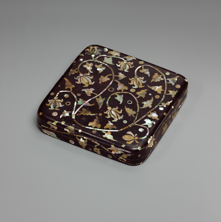
Recommendation 1A: Expand the additional images heading by default.
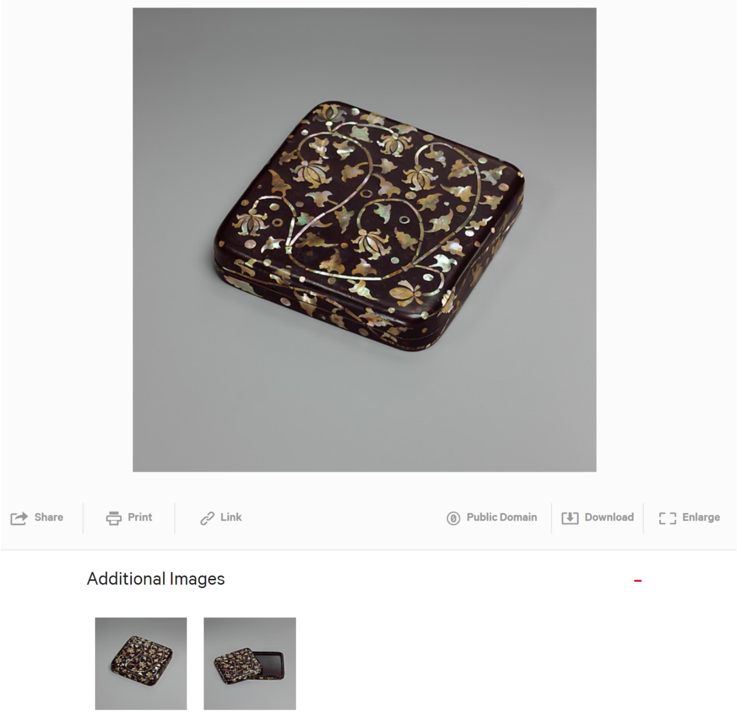
Figure 1: An expanded view of the Additional Images heading.
Most participants cited the desire for additional images as a reason for navigating to an object page.
“I thought I would see more images similar to the one I clicked on the previous page.”
- A Browser
- A Browser
However, some of these participants missed the Additional Images heading, likely due to the bold font of the object’s title and the occasional presence of foreign characters directly below. Upon locating the Additional Images heading, most participants immediately engaged with it and were pleased by the option to view their object from new angles. Interaction with Additional Images is a payoff for visiting the object page.
By expanding the Additional Images heading by default, users will be able to continue visual engagement with the object and learn that The Met website can satisfy one of their motivating needs. The presence of thumbnails here will also draw the user’s eye to this option sooner, rather than being prematurely drawn into the rows of text beneath the object image.
Recommendation 1B: Enlarge the thumbnails in the related objects section.
All eight participants of this study also relied on the Related Objects section in order to select their next object. True to form, participants relied on the object images in order to make this decision, but many participants were observed leaning forward and squinting at the screen during this process. The second recommendation of this section is to enlarge the thumbnail size in the Related Objects section in order to ease the browsing experience.
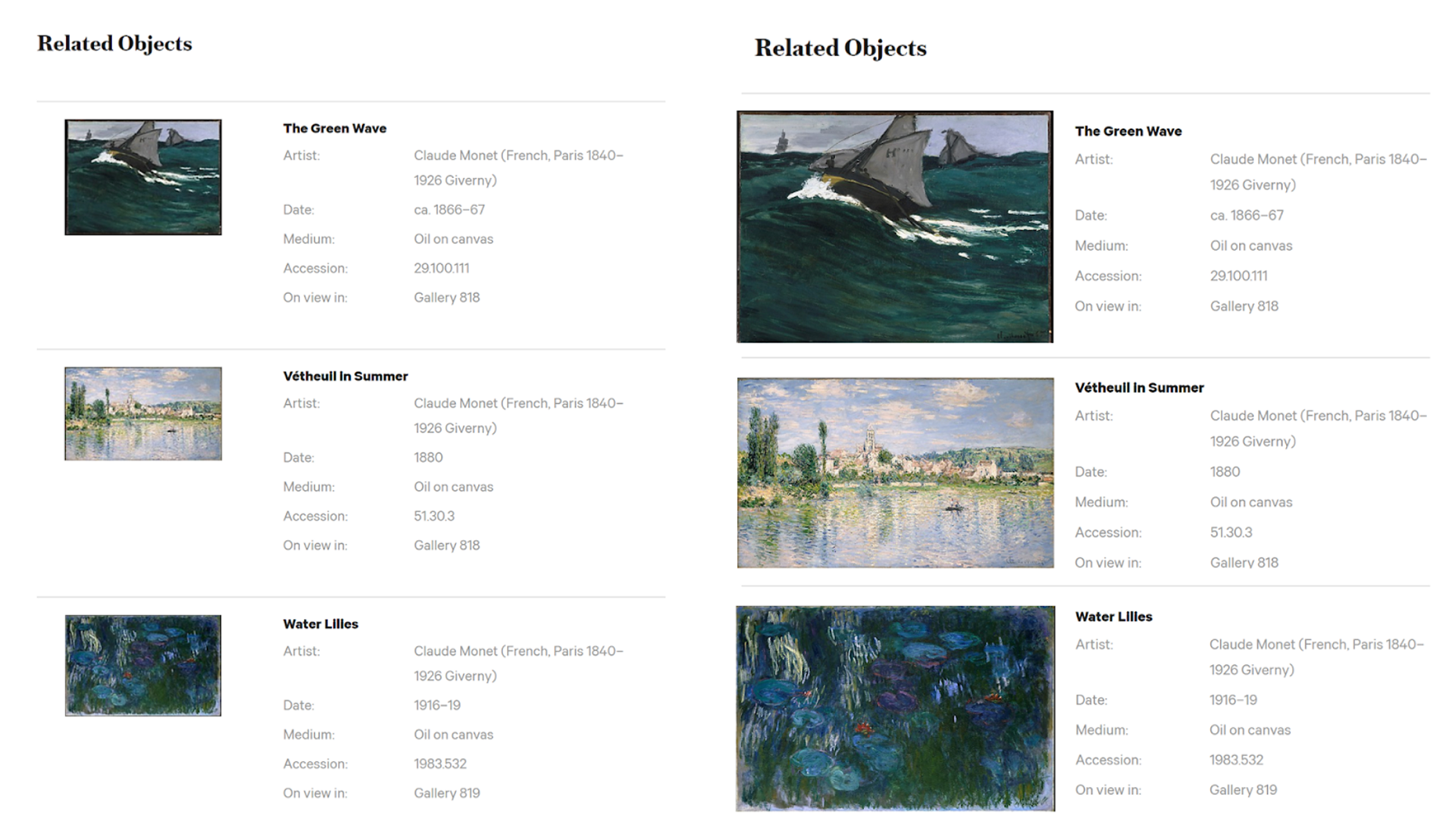
Figure 2: The current Related Objects section in comparison to a Related Objects section featuring larger thumbnails.
Recommendation 1C: Enlarge the thumbnails on the All Results search tab.
Figure 3: A comparison of the “All Results” search page and the “Collections” search page.
Participants noted the significant difference in thumbnail size between the “All Results” search tab and the “Collection” search tab, consistently citing a preference for the larger version. Whether a participant landed on the “All Results” or the “Collection” tabs depended on which search box the participant used, with the top navigation search box landing on “All Results” and the Collections search box landing on “Collection.” The small thumbnail sizes of the “All Results” tab was problematic for some participants, causing them to squint at their screen or seek out different methods to navigate the site, while the “Collection” tab performed well for participants who located it.
The second recommendation of this report is to increase the size of the thumbnails on the “All Results” page. This will make it easier for users to see the primary information they rely on for navigation decisions. Since the “Collection” tab was proven to be a successful layout, using the same format as the “Collection” tab could be useful here. Events and blog posts that appear in the “All Results” tab should also have featured images so the layout remains consistent and attractive.
Finding #2: Users seek to understand an object’s context.
When selecting objects to learn about in The Met collection, many participants shared personal stories explaining why they were inspired to learn more about an object.
“I happen to like this extra large white space in ink drawings, and my dad did one very much like that, actually.”
- A Researcher
- A Researcher
A participant’s personal context motivated them to enter The Met collection, but once they arrived at the object page, they sought out key information in order to understand the historical context of their object. In order to identify the object’s context, Browsers and Researchers alike most wanted to learn:
- Who created the object
- When the object was created
- The museum’s description of the object
- How the object fit into a historical timeline
Overall, the object page performed well for answering these questions, though some intriguing trends surfaced between the two user groups. While the motivation to learn “who” and “when” was the same for Browsers and Researchers, there were some differences in the desire for the object’s description and the historical timeline. Researchers wanted the museum’s description to provide detailed historical context and explain how the object came into the museum’s possession. Browsers wanted the museum’s description to express why the object was created (both its functional purpose and the artist’s motivation for creating the object.) For the historical timeline, Researchers were delighted by The Met Timeline of Art History microsite, but Browsers wanted to see trends related to their selected object. As an example of trends, one Browser searched for “Korea” and used filters in order narrow the results down to lacquer objects similar to the box she was initially attracted to, resulting in this view:
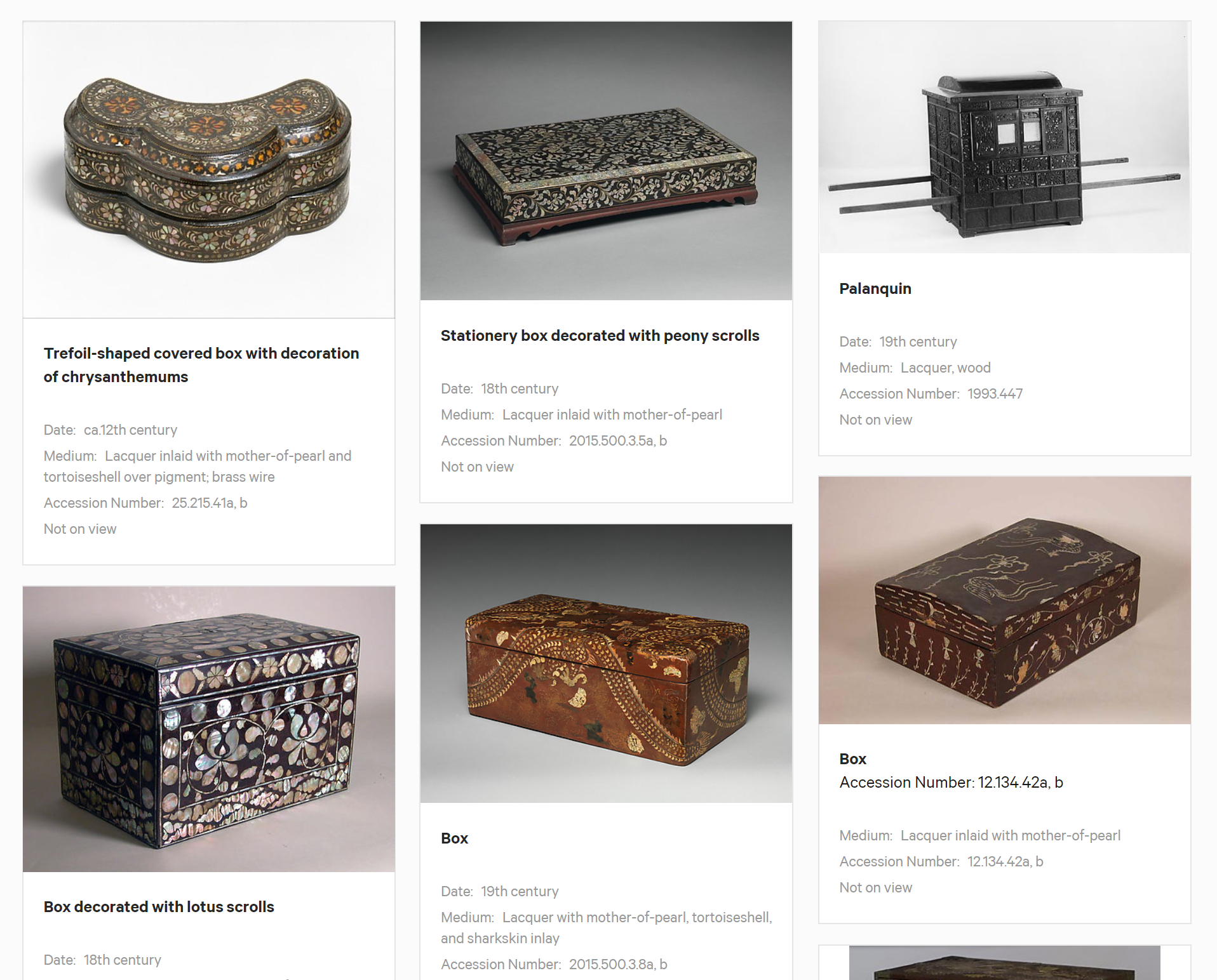
Figure 4: The results of a “Korea” search with the “Lacquer” filter.
Her response to seeing this page, which featured many objects of similar style, was:
“Oh! So it seems like there’s a running theme with silver, black, and gold and maybe copper. That might have been a trend happening around that time in Korea? Which is cool to see in all these thumbnails so I can compare them.”
- A Browser
- A Browser
Browsers seeking inspiration hope to find visual trends in art history, and Researchers hope to find detailed historical context for their object. With 70% of users initially beginning their investigation of The Met collection from an object page, it’s important to find some kind of middleground to serve both these purposes in order to guide the user deeper into The Met collection.
The Related Objects appears to recommend objects for this purpose, but participants were unsure of how the recommended objects were actually related to their selection. They tended to use their “context” criteria in order to select their next object from the Related Objects section, seeking primarily for more work by the same artist or from the same time period but sometimes finding neither. This finding leads to the following recommendations.
“These thumbnails are very dark and small, I am not sure which one to click. I guess I will choose this one because it is brighter and looks most interesting.”
- A Browser
- A Browser
Recommendation 2A: Organize the Related Objects as a timeline.
In order to meet the “context” motivation that drives both Researchers and Browsers from one object to the next, as well as clarify the relationship between selected objects and recommended objects, this report recommends organizing the Recommended Objects section as a timeline, featuring the currently selected work in relationship to works from neighboring decades. This places the artwork in context with surrounding works, catering to the Researcher’s enjoyment of navigating via the Timeline of Art History and increasing the chance that a Browser will spot a visual trend in their selected era.
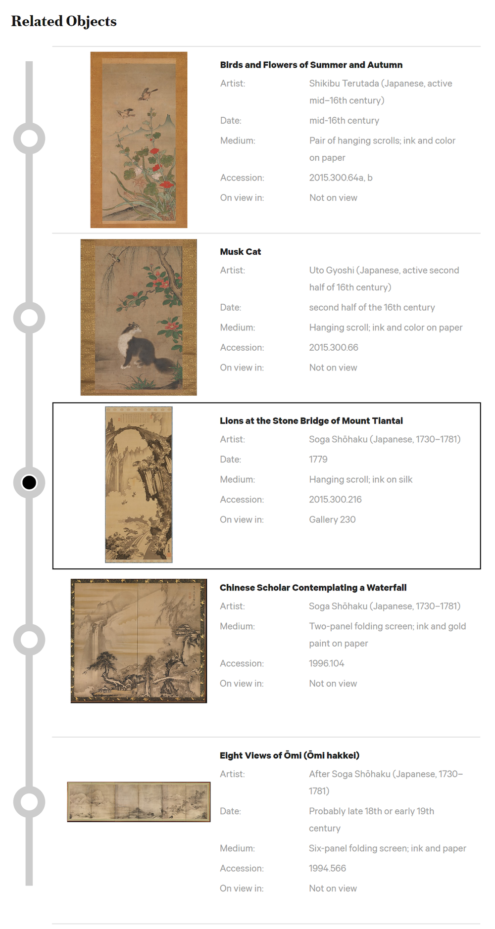
Figure 5: A mockup of the Related Objects section presented as a navigation timeline.
This mockup includes several important features for the user’s needs:
1. Sort by Date - The Related Objects are sorted by date, turning this section into a timeline that the user can navigate.
2. Include the Selected Object - This timeline includes the current object the user is viewing so that the user can understand how their selected work relates to the recommended works. This alleviates the need for the user to scroll up and down the page in order to compare the information from their current selection to the information in the related works, which was a behavior seen in Researchers.
3. Selected Object Appears at the Center - The user’s selected work appears at the center of the timeline, inviting the user to navigate by moving forward or backward in time.
4. Visual Indication that this is a Timeline - Without a visual indication that the Related Objects are a timeline, users may have difficulty understanding the relationship between objects. A “subway line” visual is used in this mockup.
Organizing the Related Objects section as a timeline for users to navigate allows users to find and follow the context of their selected objects throughout history.
Recommendation 2B: Hyperlink key categories to search results.
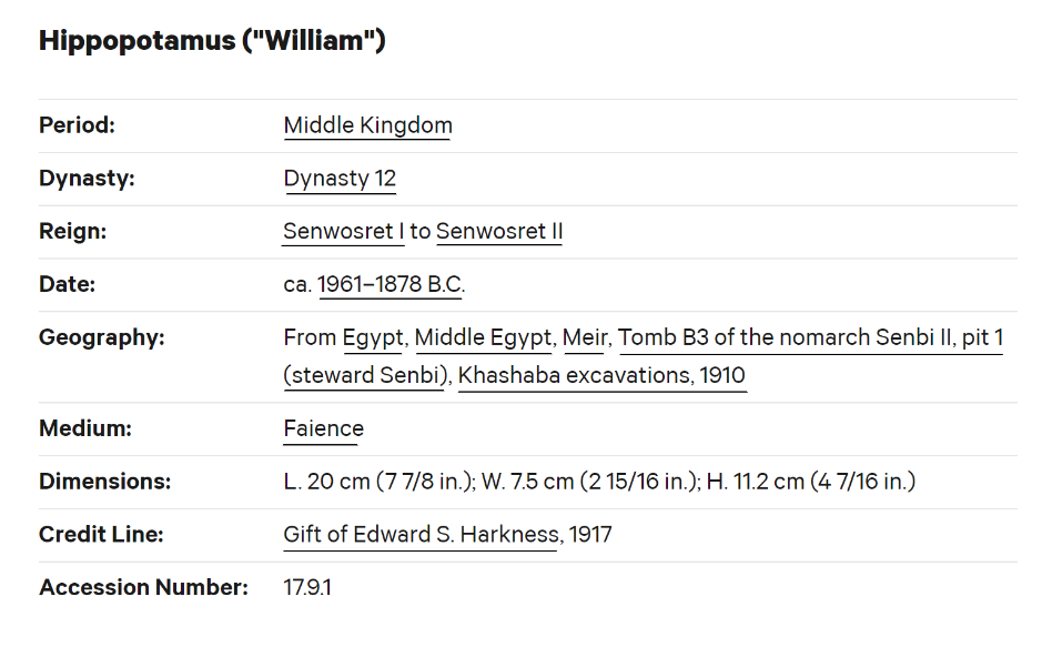
Figure 6: An example of hyperlinked search suggestions.
The second recommendation in this section is to hyperlink categories, such as artist’s names, to search results. Participants were observed hovering their cursor over items in the general information located under the work’s title to see if they could navigate to more works by the same artist or from the same time period.
“It’s not on view. I’d like to see what’s like it that is on view. Let’s see, down here I’ve got related objects… Not on view, not on view, not on view…” (Hovers over an option but doesn’t click it.) “It’s not by the same person though the style is similar.”
- A Researcher
- A Researcher
Participants often mentioned a desire to see more work by the same artist, but only Researchers opted to run searches for artist names, while Browsers instead defaulted to the Related Objects for navigation.
Finding #3: Users begin their search with a broad scope and progressively narrow their focus.
When asked to “search for an object that you would actually use for your next project,” many Researchers and Browsers hesitated when faced with the task. One Browser described the hesitation:
“Having categories is really useful to me. One of my main issues is I usually don’t know where to start.”
- A Browser
- A Browser
When directed to the “Art > Collection” page, participants were asked to describe what they expected to find when clicking on a category. Seeing the headings, participants used words like “in-depth look” and “focused” to describe the content they expected to find when clicking the links. Most participants hoped that the Collection page would instead feature categories, citing Pinterest boards as an example. The categories participants mentioned were “Paintings,” “Sculpture,” and “New to the Collection.” Additionally, some users were surprised to find that clicking on a link brought them to a search results page. One participant thought she had been taken to search results in error.
“I clicked on the blue elephant [in reference to William] but now I don’t see him... I’m not sure I’m in the right place.”
- A Browser
- A Browser
Feedback and observation of behavior during this segment of the study has resulted in two related recommendations.
Recommendation 3A: Clarify that the collections page is a list of broad recommended searches for the collection.
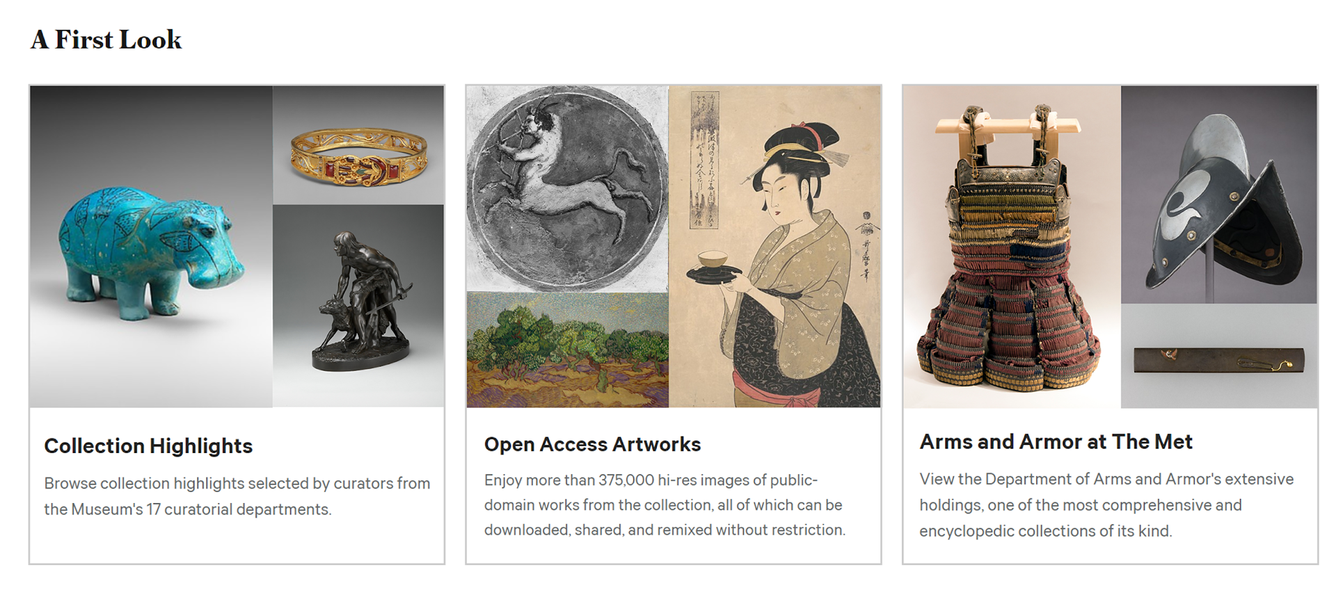
Figure 7: A mockup of “Collection Categories” for the user to choose from.
The first recommendation in this section is clarify that the categories presented on the Collection page are categories to begin broad searches within the collection. Using thumbnails with multiple images will help the user visualize what the results of clicking on the link will be. Using a “card” to associate the text with the collection will additionally help the user understand that the Collection page overall is composed of several topics to choose from, as well as reduce visual clutter by grouping the related images together.
Recommendation 3B: Clarify the behavior of search categories.
When participants clicked on a given search topic on the Collection page, they selected the topic based on the object image. When they arrived at the search results, the item that attracted them to the collection was often not available on the first page of search results. Additionally, the search bar was empty, leading participants to wonder what the search results were related to and whether they had arrived at the correct page. For example, in the case of Collection Highlights, participants were attracted to William, The Met mascot. When they clicked on Collection Highlights, however, William was nowhere to be found.
The second recommendation of this section is to clarify the relationship between the Collection topic link and the given search results. This comes in two parts:
1. Pin the featured objects to the top of the search results.
2. Populate the search bar with the topic’s search phrase.
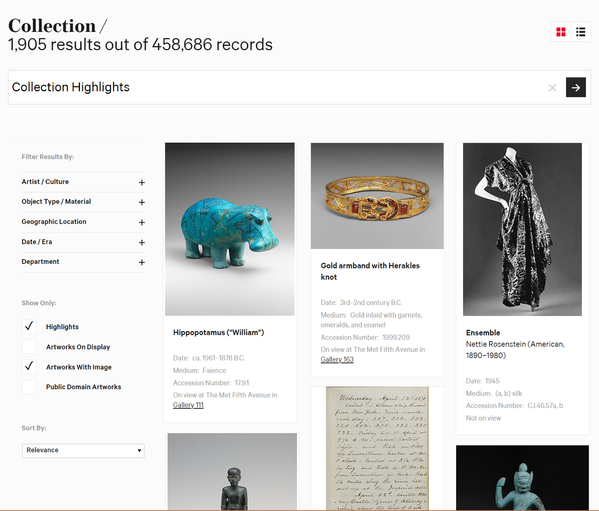
Figure 8: A mockup of a Collection topic’s search page.
This will allow users to understand that by clicking the link, they ran a search for “Collection Highlights” and they will be able to begin their foray into The Met collection starting with the object that lead them to search in the first place.
Conclusion
Visitors from all over the globe visit The Metropolitan Museum of Art, and in 2017 there were 31 million visits to the website, 35% of which were international. The online collection is popular among visitors and drew 10.4 million visitors. Key user groups included those browsing the collection for inspiration or those seeking more in-depth insights into the collection.
The results of these user test show that users are drawn to navigate via images and will dive deeper into the collection if provided with recommendations that match the context of their curiosity. In order to increase engagement with the online collection, The Met can ensure the website is drawing attention to works in the collection by using larger images and providing recommendations based on the history of relevant items. With focus on these key areas of improvement, the website can expect users to become more engaged with the online collection.

