Pratt Institute, School of Information
Prof. Sandra Davila
Dec. 2018
Prof. Sandra Davila
Dec. 2018
"We're working with the NYPL," my professor said. I was stoked.
The New York Public Library (NYPL) has 143 branches that serve a combined 3.5 million citizens of New York City, and the scale made this exactly the kind of project I wanted to work on. Sharon Denning, director of UX and design for the NYPL, provided our class with several design problems her team was facing. I picked this one:
The NYPL has thousands of online resources such as archives, databases, and digital collections available to NYPL patrons, but these resources are difficult to discover and the content is spread across independent websites.
What is the best way for NYPL patrons to discover online resources relevant to their interests?
My team, Team Opportunity Too, spent the semester learning to answer that question.
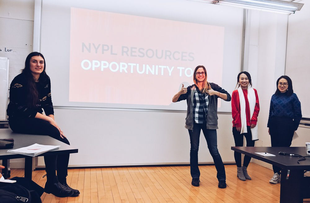
Team Opportunity Too: (from left to right) Veronika Kastova, Jill Marie Hackett (me!), Felicia Tu, and Wenjun Zhou
Meet NYPL archetypes, the Explorer, the Researcher, and the Self-Improver
To get started, the NYPL provided our class with a set of 15 archetypes. Sharon gave our team a jump-start by instructing us to focus on three recommended “researcher” archetypes for our problem.

The Explorer, the Researcher, and the Self-Improver
(Archetype icons created by Freepik.)
The Explorer
Passionate about learning a given subject. Explorers may not know what they are looking for.
Passionate about learning a given subject. Explorers may not know what they are looking for.
The Researcher
Requires authoritative sources. Not intimidated by process and often self-identifies as professional or academic researchers.
The Self-Improver
Desires to improve skill-sets or well-being, whether personal or professional.
To get started, we observed the way NYPL patrons find information.
Interviews excite me, so I jumped all over the research plan and script. We screened potential participants, seeking NYPL Patrons who were currently researching topics of interest to them, whether for work ("Researcher"), leisure ("Explorer"), or self-improvement ("Self-Improver"). For expediency, some participants recruited for these interviews were acquaintances.
Interviews were ~30 minutes in length, conducted in a preferred location for the participant, and notes were taken during the sessions. (Some were audio-recorded with permission.)
The interview was split into roughly two segments: learning about motives and observing process. Since our project was to redesign the current flow on the NYPL website, participants were allowed to use any tool to complete their task.
[PHASE 0] SET UP
___ Make sure you have pen and paper to take notes with.
Set up your laptop:
___ Check that you have enough battery. Plug in if necessary.
___ Check that you have internet connection.
___ Open a new, empty tab on your internet browser.
___ If recording, open your screen-capture software and check that it is working as intended.
[PHASE 1] INTRODUCTION
___ If approaching at the library, introduce yourself, the project, and ask if they would like to participate.
___ Allow the participant to introduce themselves. Ask for first name, age, and gender.
___ If recording, ask for permission to record the interview.
[PHASE 2] WARM UP
___ Please tell me a little about a subject you’re learning now. [or most recently] ALT: (if approaching someone in the library) What are you here to learn about today?
___ What sparked your interest in [subject]?
___ How long have you been learning about [subject]?
[PHASE 3] INTERVIEW AND OBSERVATIONS
___ What is your background with research?
___ What kind of sources do you use to learn about [subject]?
___ What’s the hardest part when it comes to learning about [subject]?
___ Let’s say you want to learn more about [subject] now. Could you please show me how to do that? (Ask them to talk about what they’re looking for as they’re doing it.)
___ (When they have arrived at a source) Why did you select [this source]?
___ What do you do with resources once you find them? Can you show me?
___ What other resources do you use? (if there is time: ask them to show you the most interesting source.)
[PHASE 4] COOL DOWN
___ Would you say that the research we just did together was typical or atypical for you? Why?
___ Is there anything else I should know about researching [subject] that we haven’t already covered?
[PHASE 5] WRAP UP
___ Tell them we’re at the end of the interview and thank them for participating.
___ Save recordings! When available, type up interview notes; share notes and recordings on Slack.
8 interviews produced 3 key insights.
Our analysis of the interviews began by breaking down the material into post-it notes, paying special attention to any mention of feelings, tools, processes, and including anything else that struck us as important. From there, we discussed patterns the we found and tried seek root causes for those patterns, referring back to direct quotes wherever possible.

We started with an affinity diagram.
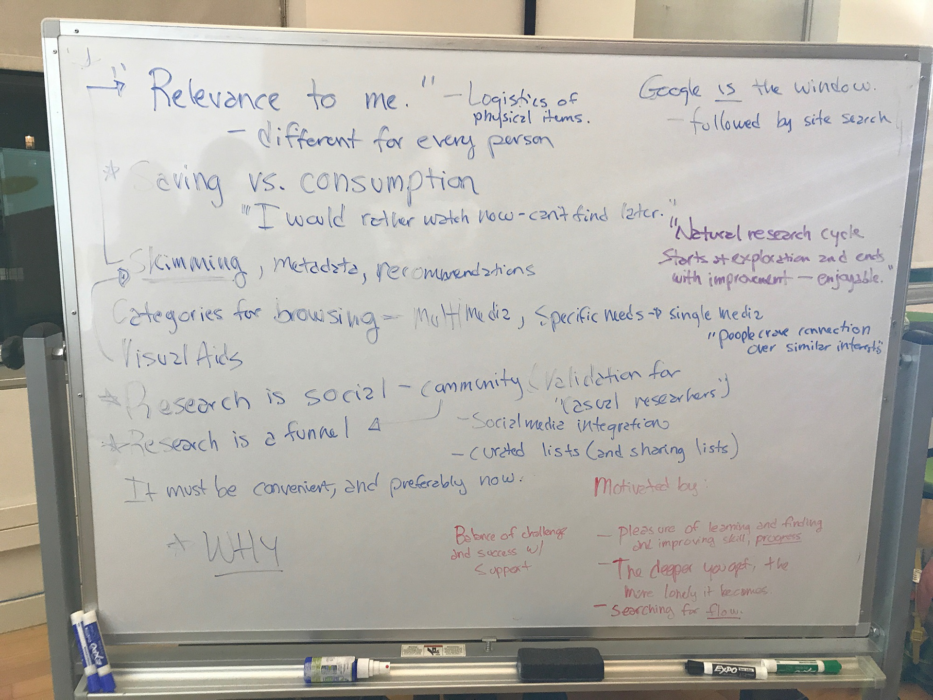
We moved to the whiteboard to record and revise theories.
Affinity diagram and exploration of our interviews.
1) Patrons seek to experience flow.
“All the fluff is annoying and boring. I just want to get into it.”
- An Explorer
- An Explorer
All participants scanned content before committing time to a resource. When asked about this behavior, they explained it as a need to determine the relevance and quality of the content. However, participants often mentioned discarding potentially relevant resources if the information was difficult to scan, and some took pleasure in the “rabbit hole” of sources that later turned out to be irrelevant. Rather than trying to save time and attention, it appears that scanning behavior is more closely related to the patron's desire to become enthralled by the subject as quickly as possible.
2) Patrons seek to experience progress.
“I’m gonna search for enamel pins and pick what looks interesting… This one looks like a logo. … What else do they make? Oh, just t-shirts. So back to pins. … Look, they all have three colors. I wonder why?”
- A Self-Improver
- A Self-Improver
Participants frequently began their search with a broad search term or category and progressively narrowed the scope of their focus. This “funnel” pattern appears to be driven by the desire to feel progress at each step. Participants who did not feel progress toward deeper understanding would switch paths.
3) The deeper patrons get, the more isolated they feel.
“Sometimes you’ll get that one question that someone’s asked but no one’s answered, and you feel alone and adrift in the universe.”
- A Researcher
- A Researcher
By far, the insight that I find most interesting is this one. Every participant in our study talked about use of social media in their research process. It turns out that, for our participants, research is a highly social activity, inspired and driven by communities built around sources and subjects.
Across the board, the strongest positive feelings were expressed around being able to share findings, curate and discover lists, and connect with others in the community for friendship or help. The strongest negative feelings came out here as well, inspired by moments when participants felt they had gone so deep into their subject that they’d lost that connection.
So, we knew our design would have to emphasize scannability, streamline access to resources, support the "funnel" shape of research, and integrate as much human experience as possible...
But what process were we designing for?
We held another whiteboard meeting to discuss the process NYPL patrons use, as well as identify some key performance indicators for our design.
Initially we identified five steps, but by checking against our key insights, we realized "Flow" was a critical step missing in our journey map.

In our case, the journey wasn't complete without the arrows to indicate flow.
While the NYPL website already contained the information required for validation and quality control steps, the information was not easy to find, scan, process, or broadcast. Thus, we decided that our redesign should focus on creating features that would support the entire research journey, from inspiration to broadcast.
The NYPL website didn't support the whole flow, so we brainstormed possible solutions that did.

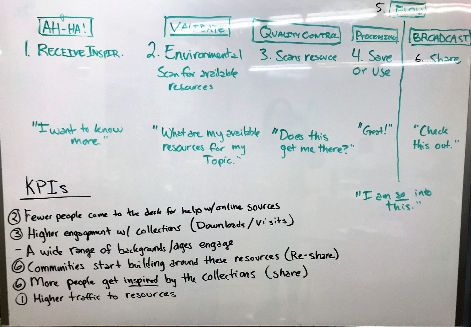
All four of us brainstormed together, but these are my own contributions.
My contribution of feature ideas.
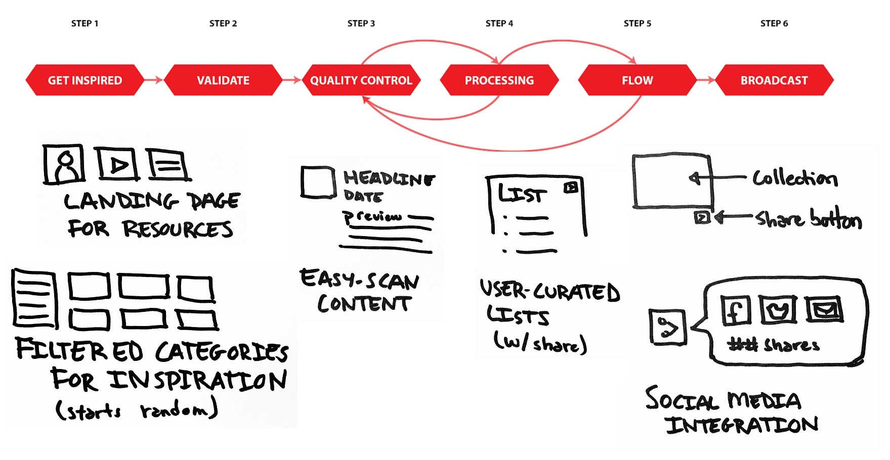
We selected a core set of features for maximum impact. While all these sketches are mine from the brainstorm, many of our ideas overlapped.
These features defined the scope of our redesign. But before we could sketch the landing page, there was one major question we had to answer:
Do Explorers, Self-Improvers, and Researchers organize NYPL content differently?
The Problem of Cats and Dogs...
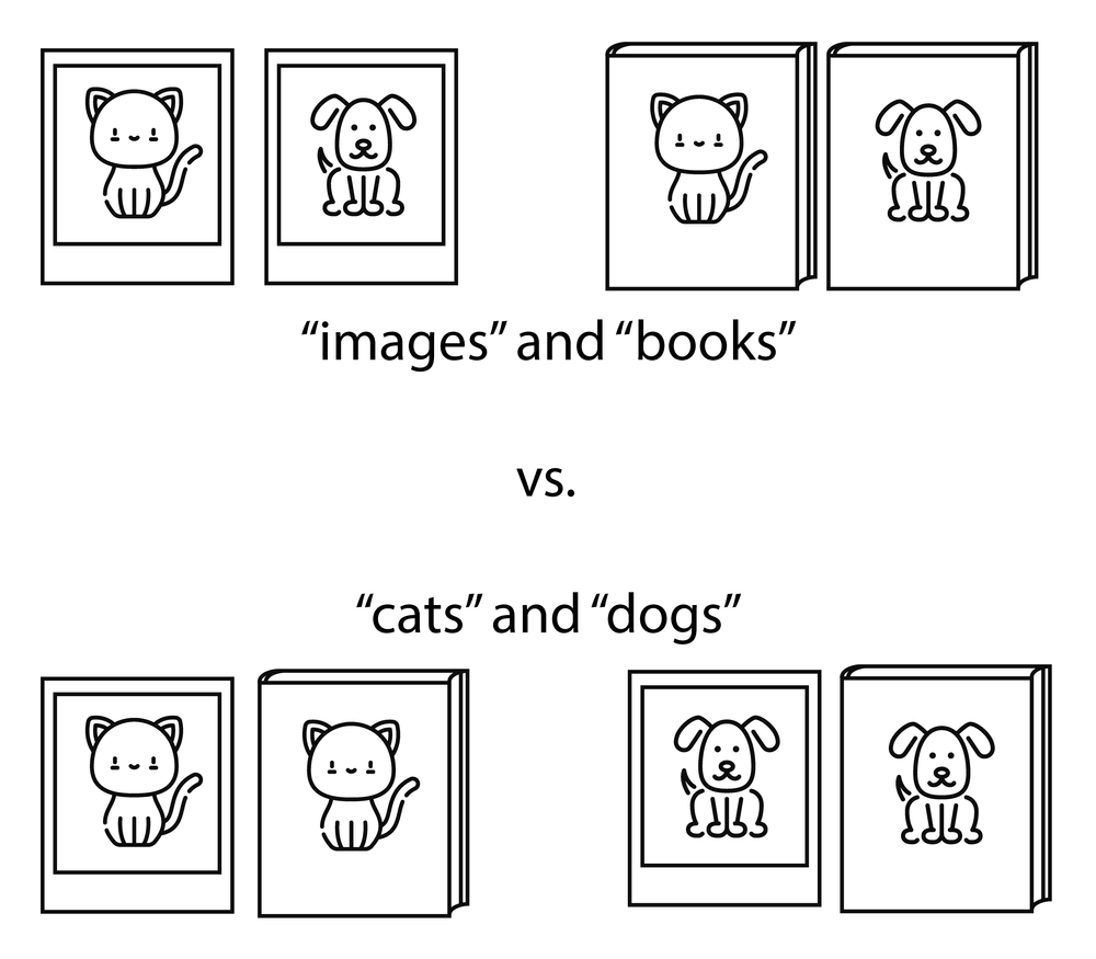
The problem boiled down to this: if you were to present a picture of a cat, a picture of a dog, a book about cats, and a book about dogs to an NYPL patron, would they create two piles "Cats and Dogs" or "Pictures and Books"? And did our archetypes do it differently?
The answer to this question would be critical to the design of our landing page, since it would act as the gateway to the NYPL resources.
We created a card sort to find out.
I guided the team for the design of this card sort. The idea was to present the user with a list of fictional NYPL items. As a whole, this list would include subjects that spanned multiple types of media, and media that spanned multiple subjects, similar to the cats and dogs example above.
I created this formula, which the team used in order to generate fictional items:
Resource Type + Subject = Fictional Item
For example, “Book” + “Fashion” = “A book about fashion design.”
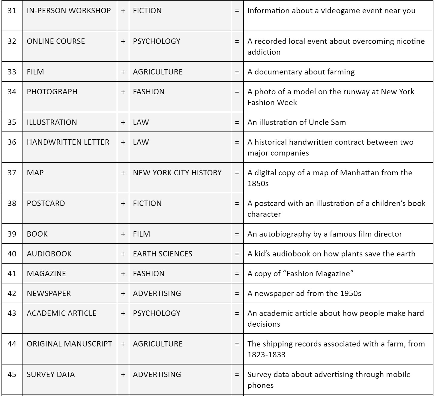
Some fictional items from our card sort.
We included screener questions in order to categorize our responses by archetype afterward. We also included a question after the card sort that asked participants how they chose to organize the cards.

Participant 4 Screener


An example of results from our card sort. This is an Explorer who organizes by topic.
"I was so torn on this exercise. A part of me wanted to sort by type (e.g. all magazines together), a part of me wanted to sort by subject (e.g. all law related things together), and a part of me wanted to sort based on time period. I ended up going by subject because when I'm researching, that's how I would really prefer to look for things. Also, it killed me to have some categories with only 1 item ._."
- Participant 4
- Participant 4
Our card sort had 46 responses, with 17 responses that had 100% cards sorted. We used those 17 responses to draw the following conclusions, though I believe the unfinished responses are telling too.
1) Most people sort by topic, but not everyone.
12 participants sorted by topic and 4 participants sorted by media-type. Within a single card-sort, these categories were mostly consistent, particularly among the media-type sorters. When asked how they decided to sort their cards, many topic-type sorters mentioned first sorting by media-type and then switching to topics as they became more familiar with the material.
Our team concluded that since both methods were consistently used, our design should support both sorting types. I'll add here that most unfinished sorts indicated a media-type sorting method, so I suspect that our cards might have been frustrating for media-type sorters and skewed the finished results toward topic-type sorting.
2) "How To" and "Children's" material is special.
Any media-type related to “homework help” or “self-improvement” in nature were categorized together, regardless of their potential relationship to other topics. This included media-types as broad as blogs, books, and events. We also saw that target-audience had some impact on topic-type sorters, though this distinction was less clear than “how to” material.
This meant that if we broke out topics as a sorting mechanism, self-improvement and target-audience should be included as major categories or filters.
3) All three archetypes categorize material generally the same way.
Regardless of archetype, individuals sorted either by topic or by media-type. Self-Improvers did tend to structure “how to” topics more than other archetypes, but Explorers and Researchers did include “how to” topics.
Because of this finding, our team decided that we could create a single interface usable by all three archetypes, under the condition that we included filters for media-type, audience, and expected topics.
At this point, we did a check-in with Sharon.
For this presentation, we reviewed what we had learned thus far and proposed a direction for our design to come: we wanted to create a "window" into the NYPL resources that would allow patrons to sort for material and save it to lists. Sharon approved our direction.
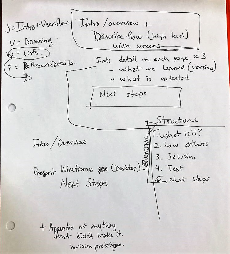
For the deck, I created the presentation outline. We all wanted an opportunity to exercise our presentation skills, so I divided the presentation into four sections: problem definition and personas, feature exploration, organization (card sort), site map and real-world examples. Concluding and introductory slides for each section worked for natural hand-offs during the presentation.
Before launching into wireframes, we checked how libraries, museums, non-profits, and eCommerce sites support the research process.
My team wanted to take a look how libraries, museums, and non-profit organizations handled problems similar to ours, but I brought up the idea of also looking at eCommerce sites like Goodreads and Amazon. Shopping carts are a bit like "lists," after all, and they rely on browsers and details pages in order to sell items. If anyone had the research process figured out, it would probably be a shopping site, right?
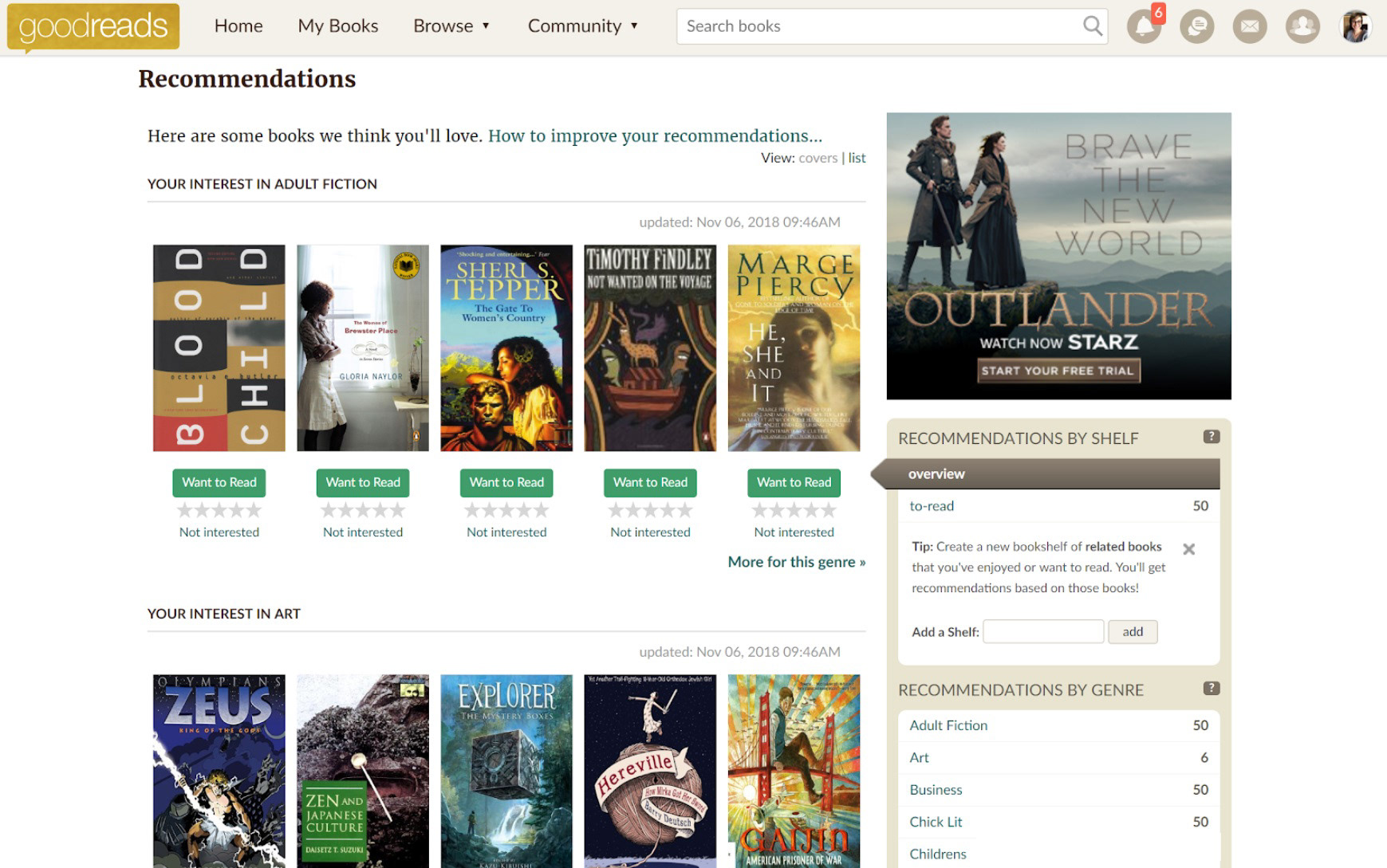
eCommerce sites used a blend of organizational styles and included our features across all pages.
Non-profit organizations tended toward categories.
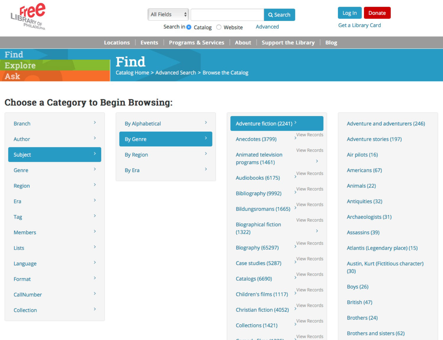
Libraries sometimes relied on filters.
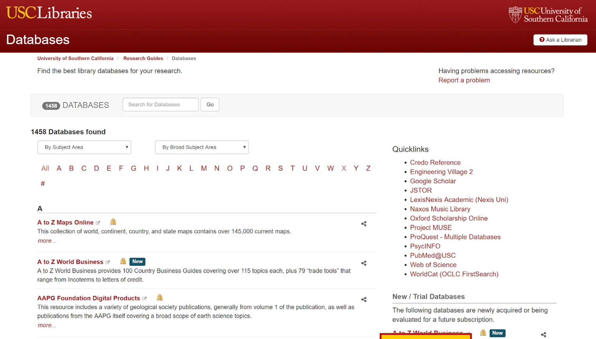
Most libraries relied on lists of databases to organize content.
Real-world examples of lists, filters, categories, and a blend of all three.
Full summary of results can be seen here.
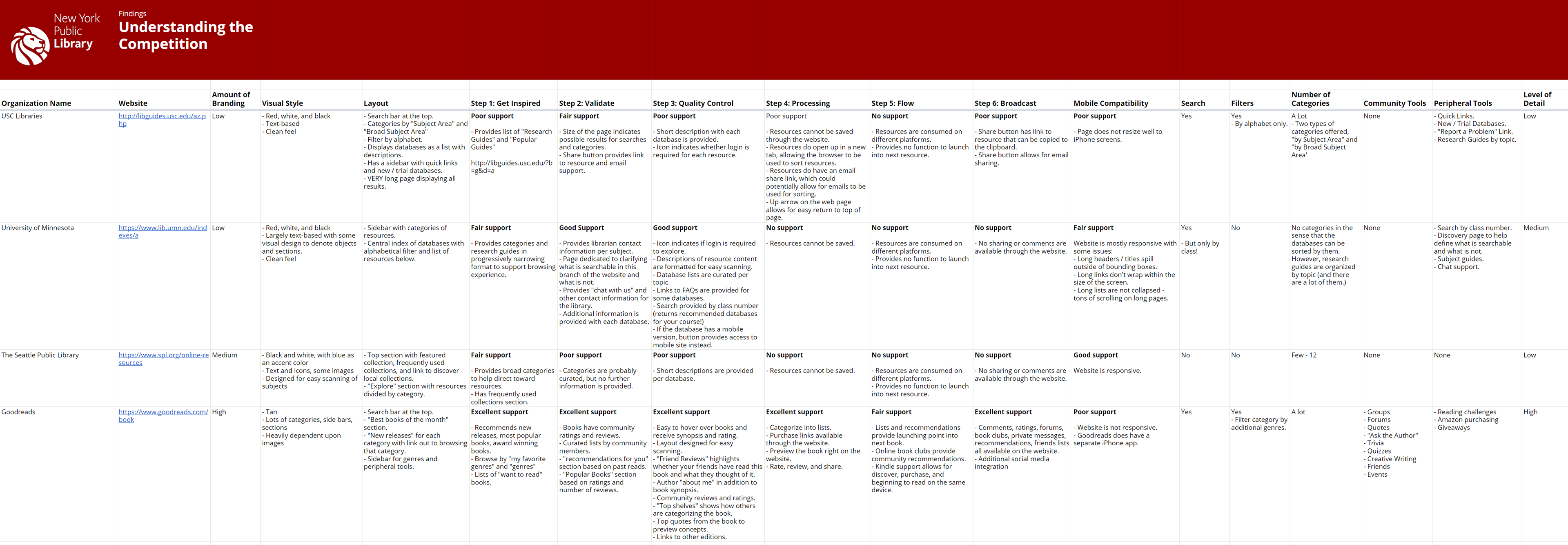
Sample of my competitive analysis.
My contribution to the team's competitive analysis.
Legal FYI: The use of the NYPL logo is for demonstration purposes in student work and is no way representative of an endorsement of such work by the NYPL.
We took a look at dozens of sites but selected 12 for a full analysis. Turns out the hunch was pretty close. a summary of results can be seen in the smaller image above, but the main takeaway for our design was this:
"Processing," "Flow," and "Broadcast" are the least-supported steps by libraries, museums, and non-profit organizations. But eCommerce sites nail it.
So we decided to test an eCommerce-inspired redesign.

Three pages to support the entire flow.
Our team spent a week creating a clickable prototype to test our ideas.
This was a lot, so we took a divide-and-conquer approach. Veronika took on the browsing page, I took on the resource details page, Wenjun created the lists page, and Felicia dug through all three pages and searched for social media opportunities.
8 participants tested our prototype.
We wanted to know:
- Can users filter resources using our new browser?
- Does the user have all the information they need to make a decision (and act on it) from the resource details page?
- Are lists appearing at the right time, in the right way, for the patron's research journey?
- Does the user have all the information they need to make a decision (and act on it) from the resource details page?
- Are lists appearing at the right time, in the right way, for the patron's research journey?
Tests were conducted using laptops in a location that was convenient for the participants. Notes were taken and some were audio recorded with permission.
For the test, we asked participants to imagine that they were working on a design project and they wanted to find reference for 1930's fashion. We then asked them to freely explore the browser and talk to us about what they saw.
We learned the Resource Browser needed context and more granular filters.

Veronika's original prototype, which we tested.
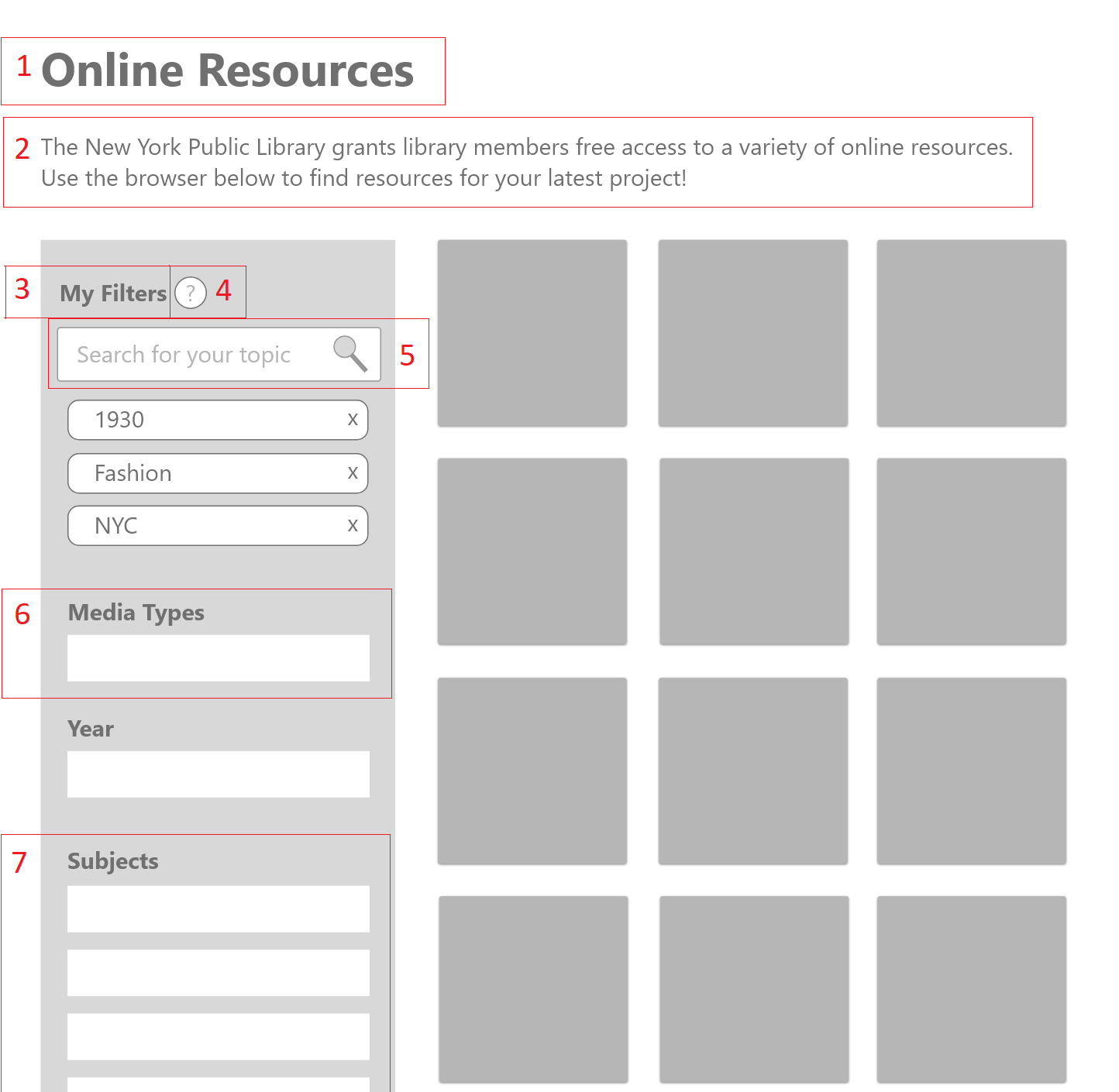
My proposed revision based on results.
Our resource browser, before (left) and after (right) a round of user testing.
"Oh! I didn't realize these were galleries or archives of some kind. I thought I was just looking through books."
- H.P.
- H.P.
The first draft of our browsing page was prepared by Veronika. From her prototype we learned:
1. The “Subject” drop-down menu was too long.
2. Participants wanted to view all media types together.
3. Hovering over tiles for more information worked well with the scanning behavior of participants, but more information needed to be provided before they would click.
4. Participants didn’t understand the resource browser was used to search for archives and collections as opposed to individual results (like a single book or journal article.)
Taking this feedback from our users, I tried a revision.
1. I added a title to help orient the user. I selected “Online Resources” rather than "Articles & Databases" because our NYPL patrons used more plain language to describe their own resources. For example, one resource available through the NYPL is free access to Lynda.com, which patrons likely would not describe as a "database" but a "resource" instead.
2. I added a description of the browser content.
3. I broke the sidebar into sections. The idea was to break the sidebar into sections based on our card sort. Organizing “by subject” is a different than “by media-type” and “by year.” Users could pick the section most relevant to them and then refine with the other categories as needed.
4. I added help for how to use filters. As the user refines their search, more filters are added to “my filters.” These filters can be removed by pressing the “x” button. While this may seem clear to us, I added a tool tip to explain this critical behavior just in case.
5. I moved the search bar to the sidebar. The intended behavior of the search bar was to add more filters. Since search and filters are related, I set them in closer proximity.
6. The tabs are now filters.
7. The subject drop-down menu is now categories by top-level subject. The NYPL has 13 top-level categories used to describe its content, so I broke these out into individual categories.
We learned the resource details page needed stronger labels, but was otherwise understood.
I selected the resource details page for my deep dive for two reasons:
1) All of our interviewees began their research process with a Google search, so the resource details page would likely be the user's first impression of an NYPL resource.
2) The resource details page has the potential to carry access to the entire research pattern, which might encourage the user to explore and share resources on the NYPL website, which might in turn create communities based around NYPL content. I thought it would be fun to try maximizing this.

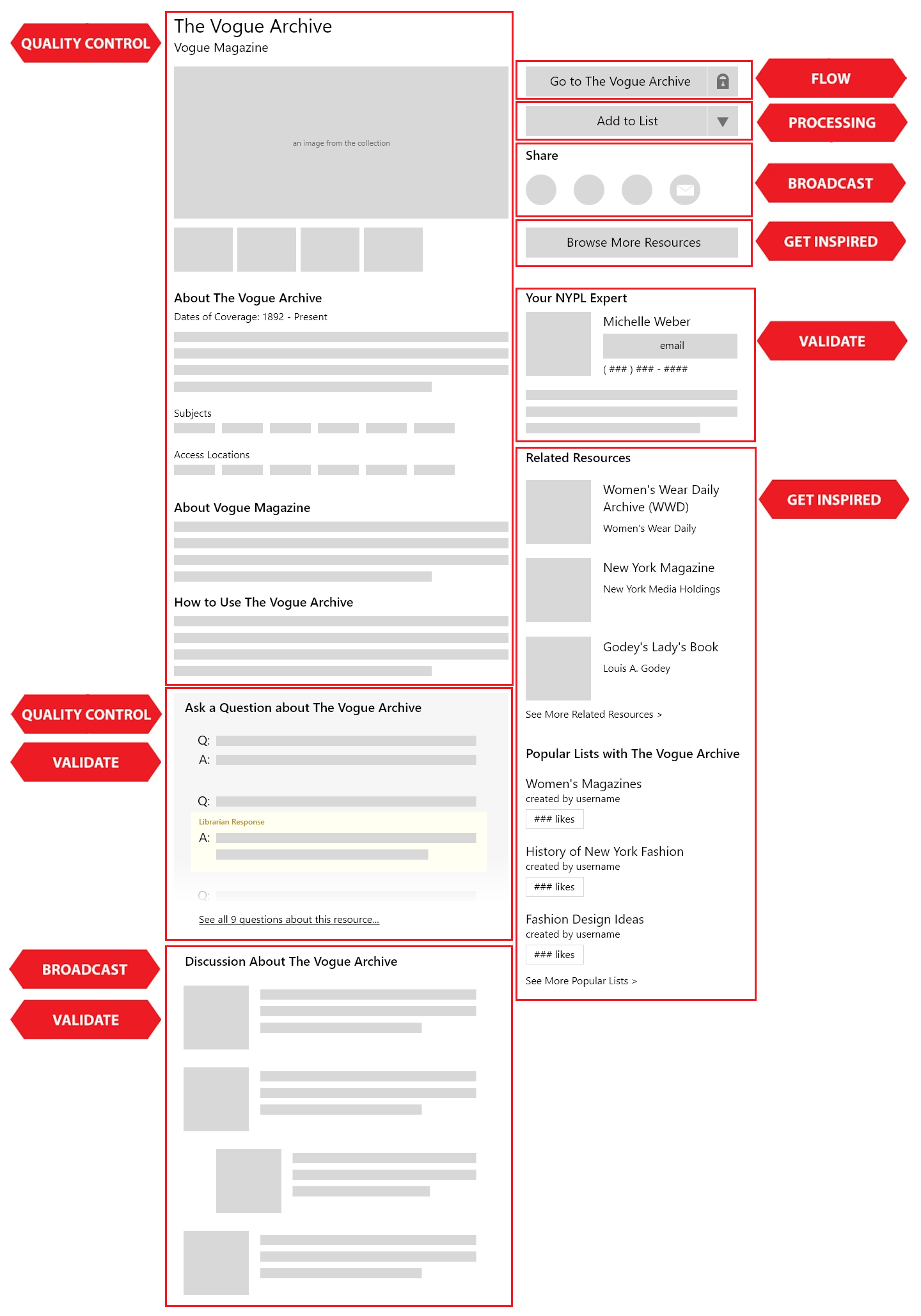
The resource details page, my primary contribution to our wireframes.
"What's 'Your NYPL Expert'? Wait- is that a librarian? Fantastic, I can't say how many times I just wanted to know who to ask for help."
- B.A.
- B.A.
Participants responded positively to the features and order of content on the page. However, some labels like "Your NYPL Expert" need to be reworked, and the difference between "Related Resources" and "Popular Lists" need to be clarified.
We learned that lists needed to be reorganized after the first few tests.
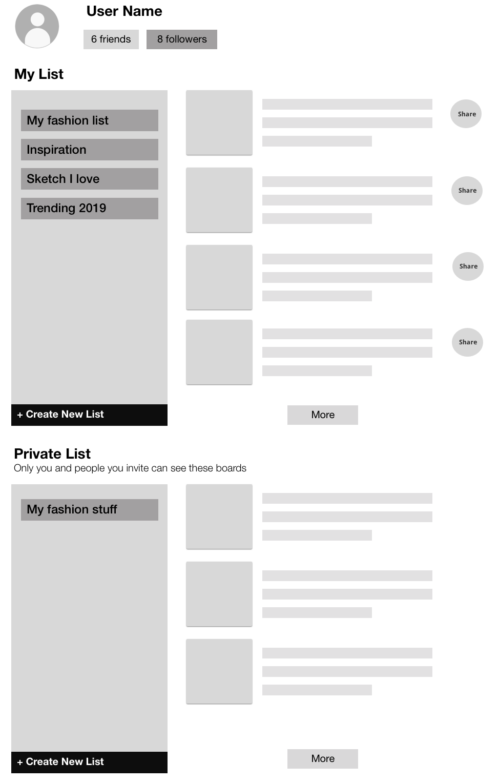
Tested page with separate public and private lists.
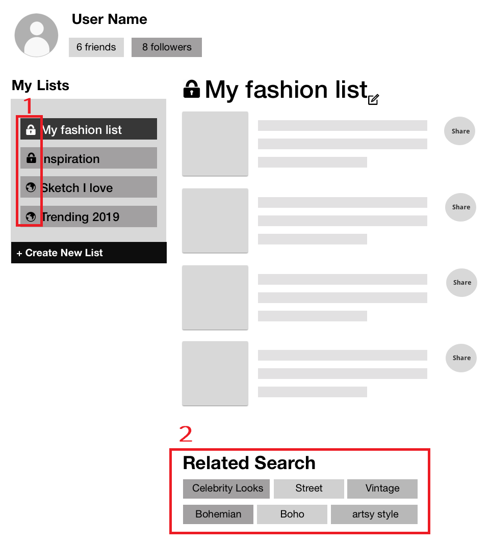
Revised list page, tested! It works much better.
The lists page, before (left) and after (right) a round of user testing.
When we began testing our prototype, users had difficulty understanding the lists page. They asked why two lists were displayed (one section for public lists, and another section for private lists) and exploration of our prototype dead-ended on this page.
Instead of completing all eight tests with the first wireframe, we did a quick revision half-way through. We updated the following:
1. Lists were condensed into a single section. We indicated if a list was private or public through the use of icons.
2. We added related keywords at the bottom of the list. My suggestion to close the loop from processing back into earlier steps of the journey was to create a list of keywords, automatically generated from the contents of the list. These keywords could link to our browsing page with the search already filled in so the user could find more resources to build their list.
3. We removed the "more" button. The list could just display all contents instead of breaking it into pages.
4. Any resource can be shared. Initially only public lists would display share buttons for content.
After all of that, we presented our findings.

My brainstorm page for the presentation format (left) and the opening slide of our presentation (right).
For the final presentation, I created the outline for the presentation and Veronika created the visual design. We then assigned sections of the outline for each of us to speak about, and the person responsible for speaking created the final slide for our deck.
Our presentation was structured in four parts:
1. Overview of process and structure (presented by me)
2. Resource Browsing (presented by Veronika)
3. Details Page (presented by Felicia)
4. User-Curated Lists (presented by Wenjun)
For each page, we answered the following questions in order:
1. What is it?
2. How did others do it?
3. Our solution
4. Test results
5. Next steps
The story we told in this presentation was heavy in content from our competitive analysis onward because we already had a midpoint check-in with our stakeholder, Sharon, after the card sort.
We wrapped up the end of the semester with a celebration!
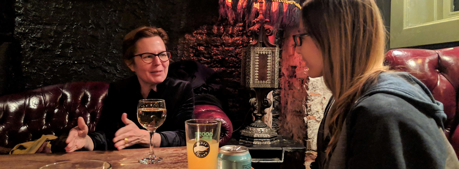
Our whole class was invited to celebrate the end of the semester with Sharon! (left)
Overall, our work was well-received. Uncovering the research journey was pivotal to our project and informed our design decisions from that point on. Sharon particularly enjoyed the discovery of how social the research process was, and she loved the suggestion that librarians be represented alongside NYPL resources.
This project represents a semester of learning and discovery with my Information Architecture & Interaction class. We started from scratch, knowing nothing about NYPL Patrons and their needs, and we followed a design process all the way through to prototyping. This project taught me that my fascination lies in research, so that's what I'll be focusing on with future projects!

